Introduction
If you have ever created charts in Excel but felt they look static and boring, you are not alone. Most people know how to insert charts, but very few know how to turn them into an excel interactive dashboard that responds instantly to user input. This is exactly why managers, clients, and office teams struggle to understand reports quickly.
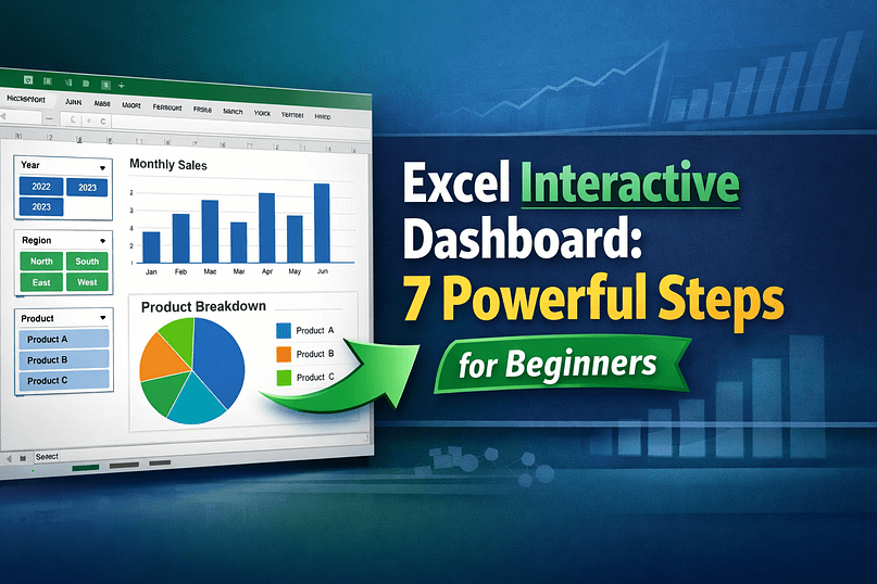
An excel interactive dashboard allows users to filter data using slicers and instantly see changes in charts, tables, and KPIs—without touching formulas. The problem is that many tutorials skip basics or assume advanced knowledge, leaving beginners confused and frustrated.
In this guide, I will show you how to build an excel interactive dashboard step by step, using slicers and charts in a simple, practical way. By the end, you will confidently create dashboards that look professional, save time, and impress anyone who opens your Excel file.
Why Most People Struggle With Building Excel Dashboards
Most beginners fail to build a proper excel dashboard tutorial because of these common issues:
- They start designing charts before cleaning data
- They don’t understand how slicers actually work
- They use normal ranges instead of Excel Tables
- Charts are not connected correctly to slicers
- Dashboard looks cluttered and confusing
Another big mistake is trying to learn everything at once—PivotTables, formulas, VBA, and charts. In reality, you don’t need advanced formulas to create an excel dashboard with slicers.
Once you understand the correct order and logic, building dashboards becomes easy and repeatable.
What You Need Before Starting
Before creating your excel interactive dashboard, make sure you have the following:
Tools Required
- Microsoft Excel 2016 or later (Excel 365 recommended)
- Basic understanding of rows, columns, and charts
Data Requirements
- Clean data (no blank headers)
- Each column should have one type of information
- No merged cells
Skills Needed
- Insert charts
- Create PivotTables (basic level)
- Use mouse clicks (no coding required)
If your data is messy, fix it first. Dashboards always fail because of bad data, not bad design.
Step-by-Step Guide to Build an Excel Interactive Dashboard
Step 1: Prepare and Convert Data into a Table
Select your entire dataset and press Ctrl + T to convert it into an Excel Table.
Why this matters:
- Tables auto-expand when new data is added
- PivotTables and charts update easily
- Slicers work better with tables
Give your table a meaningful name like SalesData.
Step 2: Create a PivotTable for Dashboard Logic
Go to Insert → PivotTable and select your table.
Create PivotTables for:
- Total Sales
- Sales by Month
- Sales by Region
- Sales by Product
Each PivotTable should answer one question only. This keeps your excel dashboard with charts clean and fast.
Tip: Place PivotTables on a separate sheet called Backend.
Step 3: Insert Charts from PivotTables
Now convert each PivotTable into a chart:
- Column chart → Monthly trends
- Bar chart → Region comparison
- Pie or donut → Product share
These charts will become the visual core of your excel data visualization.
Avoid:
- 3D charts
- Too many colors
- Gridlines everywhere
Simple charts communicate faster.
Step 4: Add Slicers to Control the Dashboard
Click on any PivotTable → Insert Slicer.
Choose fields like:
- Year
- Region
- Product
- Salesperson
Slicers are what make your excel interactive dashboard truly interactive.
Resize slicers neatly and place them at the top or left side of the dashboard.
Step 5: Connect One Slicer to Multiple Charts
This is where most people get stuck.
To learn how to connect slicers to charts in Excel:
- Click the slicer
- Go to Slicer Settings → Report Connections
- Select all PivotTables
- Click OK
Now one slicer controls multiple charts at once.
This step alone transforms a normal report into a professional excel dashboard with slicers.
Step 6: Design the Dashboard Layout
Create a new sheet called Dashboard.
Best practices:
- KPIs at the top
- Charts in the middle
- Slicers aligned on one side
Use:
- White background
- Consistent font size
- Minimal colors
Your goal is clarity, not decoration.
Step 7: Make It User-Friendly
Hide gridlines:
- View → Uncheck Gridlines
Lock formulas:
- Protect backend sheets
- Allow slicer interaction only
Now your excel interactive dashboard is safe and easy to use by anyone.
Real-Life Office and Freelance Example
Imagine you are an office executive tracking monthly sales.
Instead of:
- Sending multiple Excel files
- Explaining numbers in meetings
- Updating reports manually
You open one excel interactive dashboard.
Your manager selects:
- Month = January
- Region = South
All charts update instantly.
This saves:
- Hours of manual work
- Confusion during meetings
- Repeated explanation
Freelancers use excel dashboards with charts to:
- Impress clients
- Justify performance
- Win repeat projects
Common Mistakes and How to Fix Them
- Slicer not working
→ Check PivotTable connections - Charts not updating
→ Use Excel Tables, not normal ranges - Dashboard looks messy
→ Reduce charts, focus on insights - Slow performance
→ Avoid too many PivotTables - Wrong numbers shown
→ Check source data formatting
Fixing these instantly improves dashboard quality.
FAQs (Very Important for SEO)
What is an excel interactive dashboard?
An excel interactive dashboard is a visual report where charts and data update automatically using slicers and filters.
Do I need VBA to make an excel dashboard interactive?
No. Slicers and PivotTables are enough for most professional dashboards.
Which Excel version is best for dashboards?
Excel 365 or Excel 2019 works best due to better performance and features.
Can I share an interactive dashboard with others?
Yes. Anyone can use slicers without editing formulas.
Is this useful for beginners?
Absolutely. This excel dashboard tutorial is designed for beginners and office workers.
Conclusion
Building an excel interactive dashboard is not about complex formulas or coding. It’s about clean data, smart PivotTables, and properly connected slicers. Once you understand the logic, you can reuse the same structure for sales, finance, HR, or blogging analytics.
Start small. Build one dashboard. Improve it step by step.
If you found this guide useful, explore more Excel and automation tutorials on WebPlayX.com to improve productivity and stand out at work.
Your next dashboard can change how people see your skills.